Context
A better solution for diabetes?
Thrive's purpose is to help patients by providing accessible and innovative education about diabetes.
They provide high-quality educational content, personalized learning experiences, and a one-on-one physician-patient interaction to enhance the knowledge and skills of the patient.

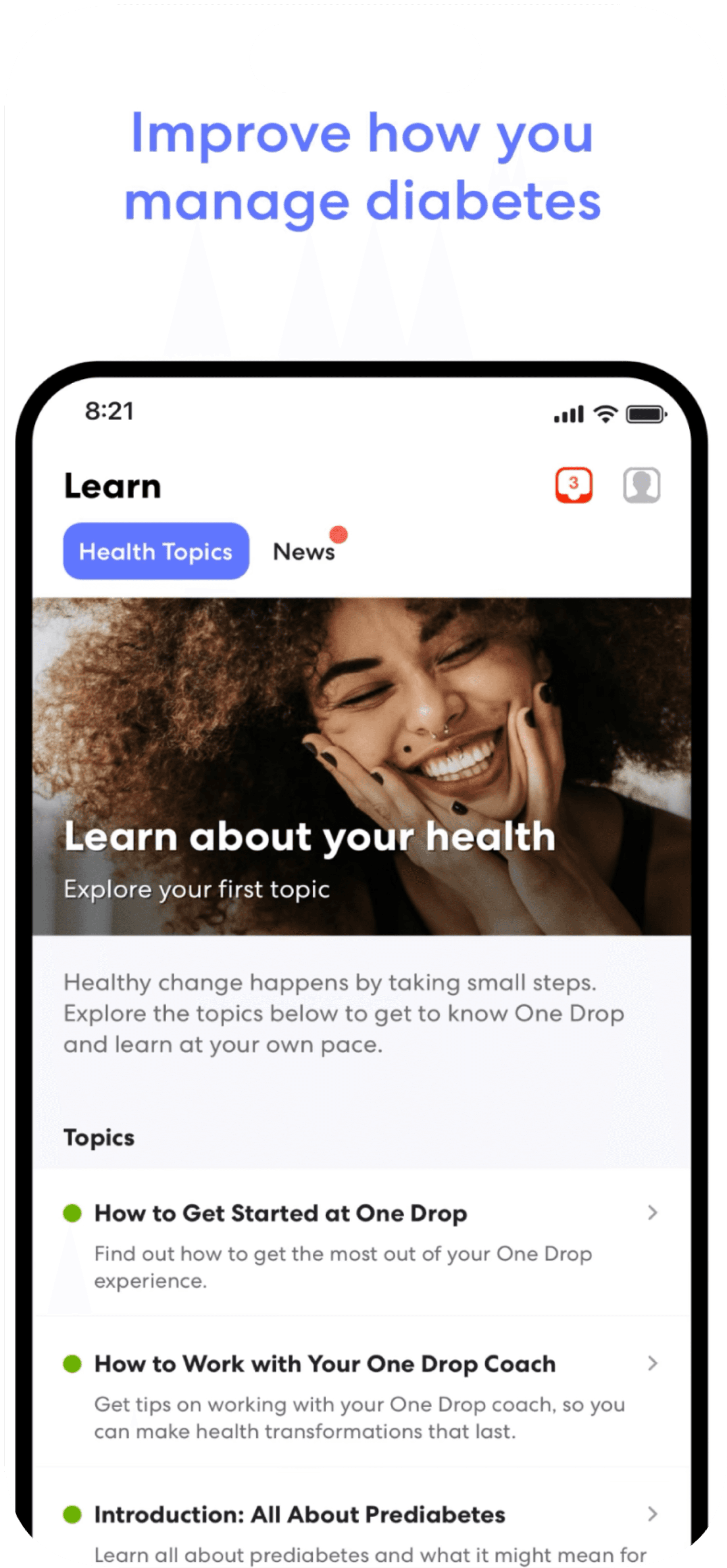
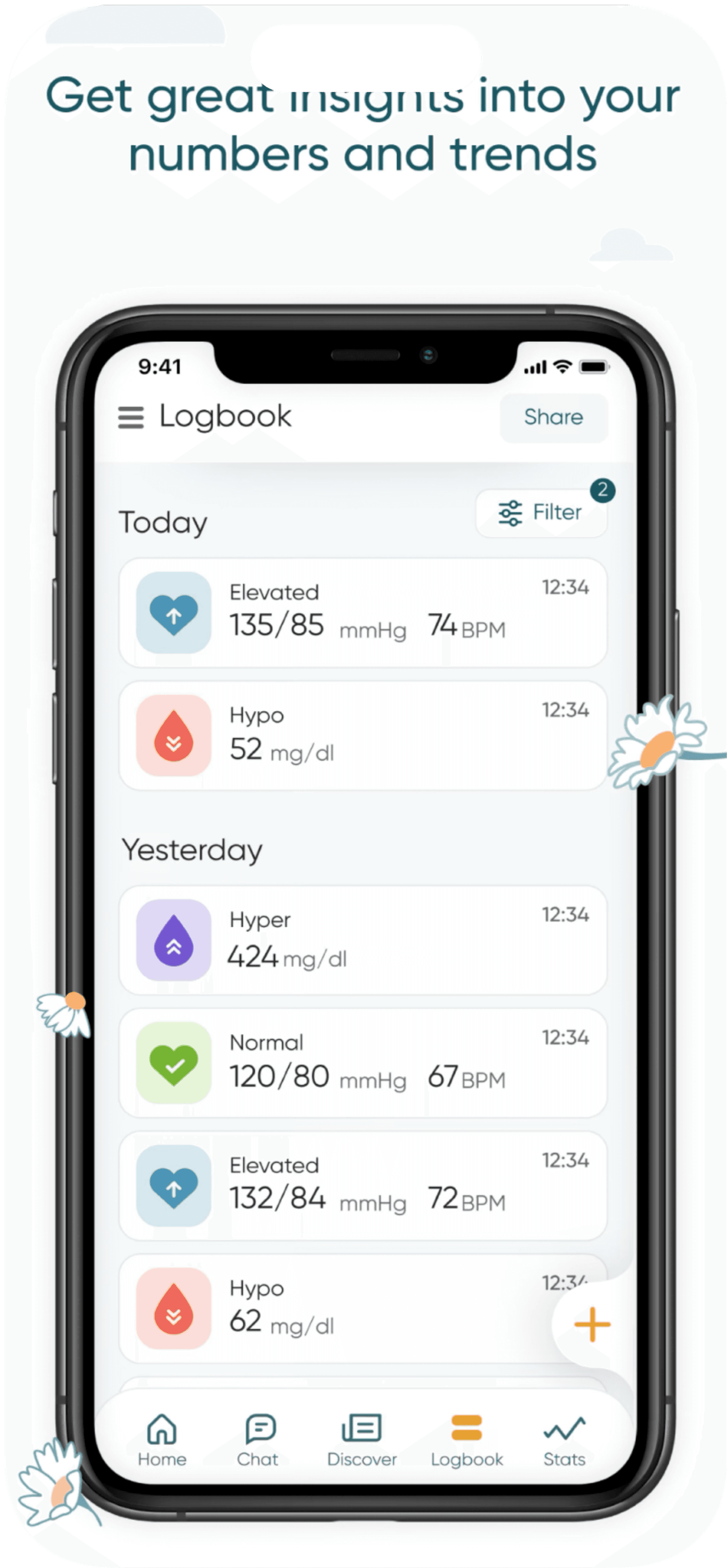




To enhance our understanding of the relationship between patients with diabetes and their physicians, we aim to develop a tool to assess patients' confidence in their knowledge of diabetes.
New Feature
Our Goal
Nearly
people ages 65 and older has diabetes
1/3
Target Audience
This new feature will be designed to be simple and easy to use, recognizing that diabetes is more prevalent among elderly individuals.
01/ ideation
02/ Prototypes
03/ Interview
04/Define
05/ Reflection
Our Phases
01/Ideation


Pop up survey
Pros
It's straightforward.
It's too simple.
Having a pop-up looks dull
Writing needs to be more clear
A
B
It would be a simple click of a button for users.
Cons
Slider bar
Updated Slider bar
Smiley face scale

A
B
C
Pros
Cons
It's straight to the point
Smiley face rating makes it more lively
All the expressions are presented which won't confuse the user.
A
B
C
A
B
A
Pros
Cons
The slider bar is more accurate than faces
There isn't a number indicating the confidence level.
A
Pros
Having the number will give us the most accurate results on how the users feels
We added another sentence to make sure the user truly understands the idea.
A
B
C
Having encouraging message will motivate the user to learn
The face won't be 100% accurate for the user
Doesn't look professional

Cons
A
Having a number above a slider could give the best accurate results
Brainstorming ideas
Initially, I came up with a few sketches on how the design should come out



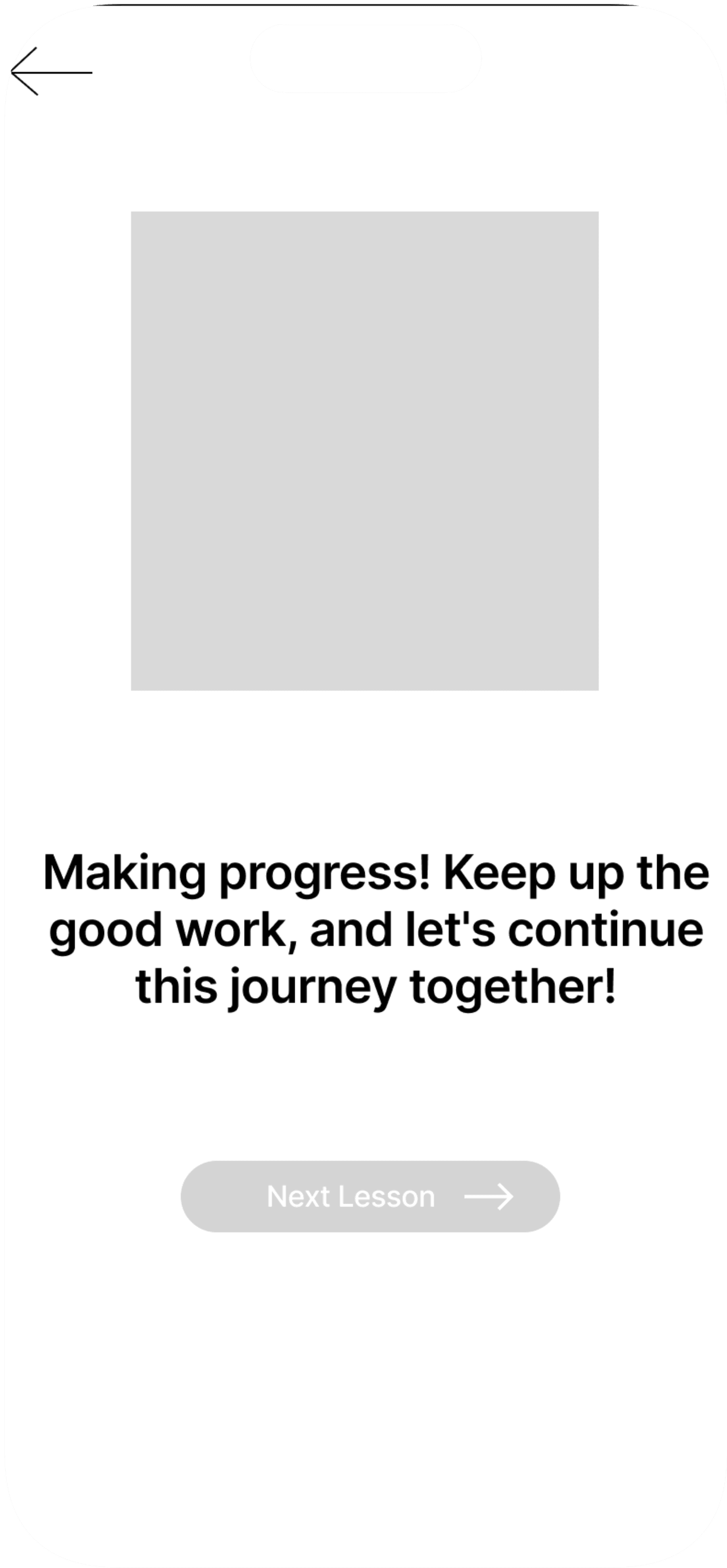
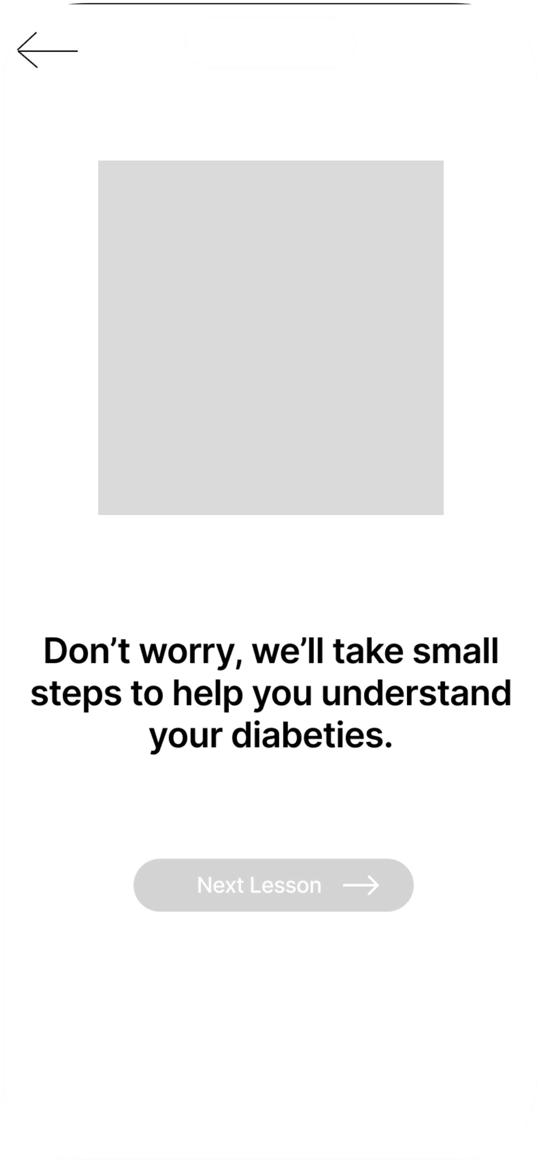
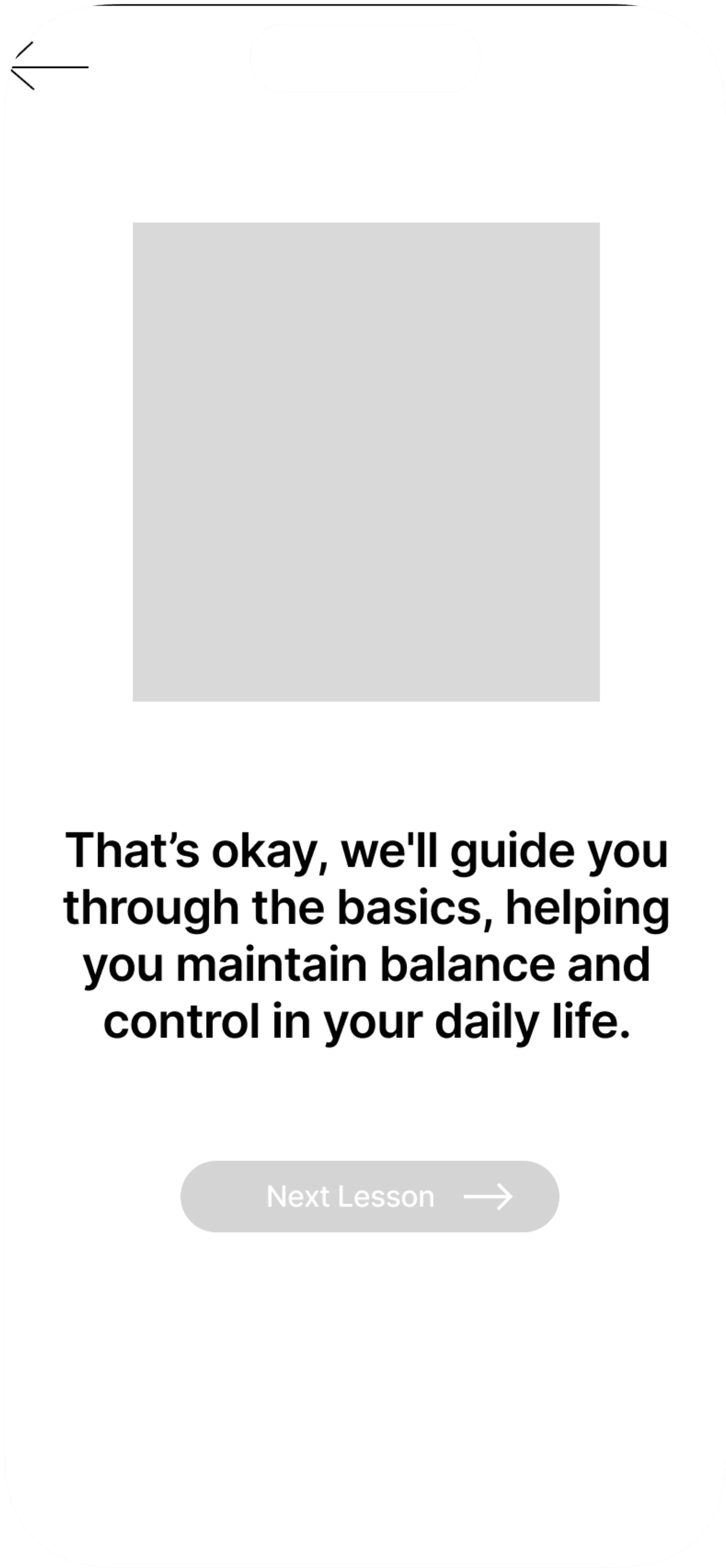
02/ Prototypes
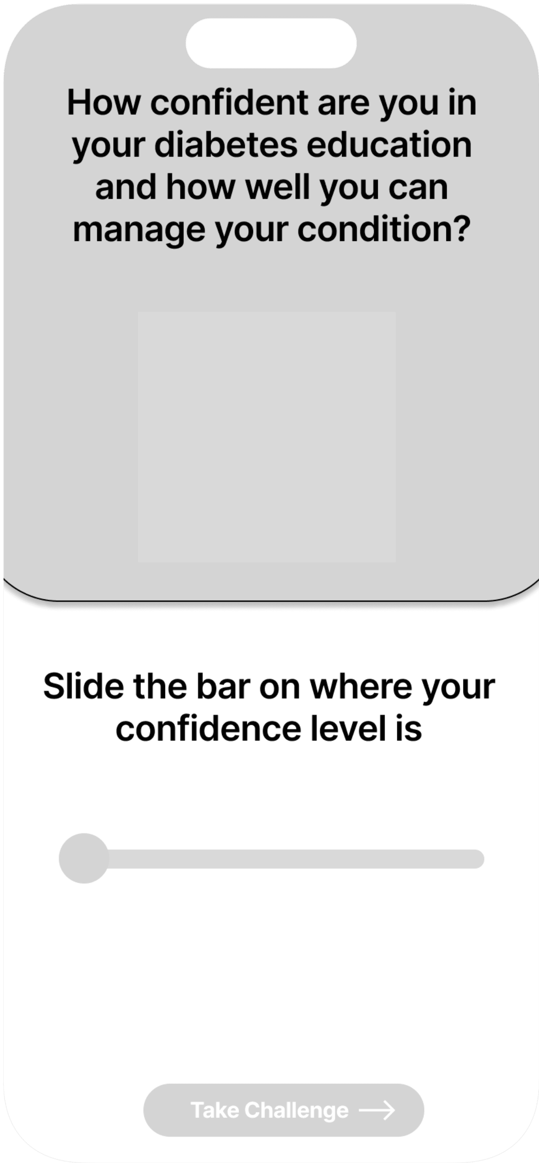
Low-Fidelity Wireframes
"Home" Screen
"Not Confident at all" Screen
"Somewhat Confident" Screen
"Neutral" Screen
"Confident" Screen
"Very Confident" Screen
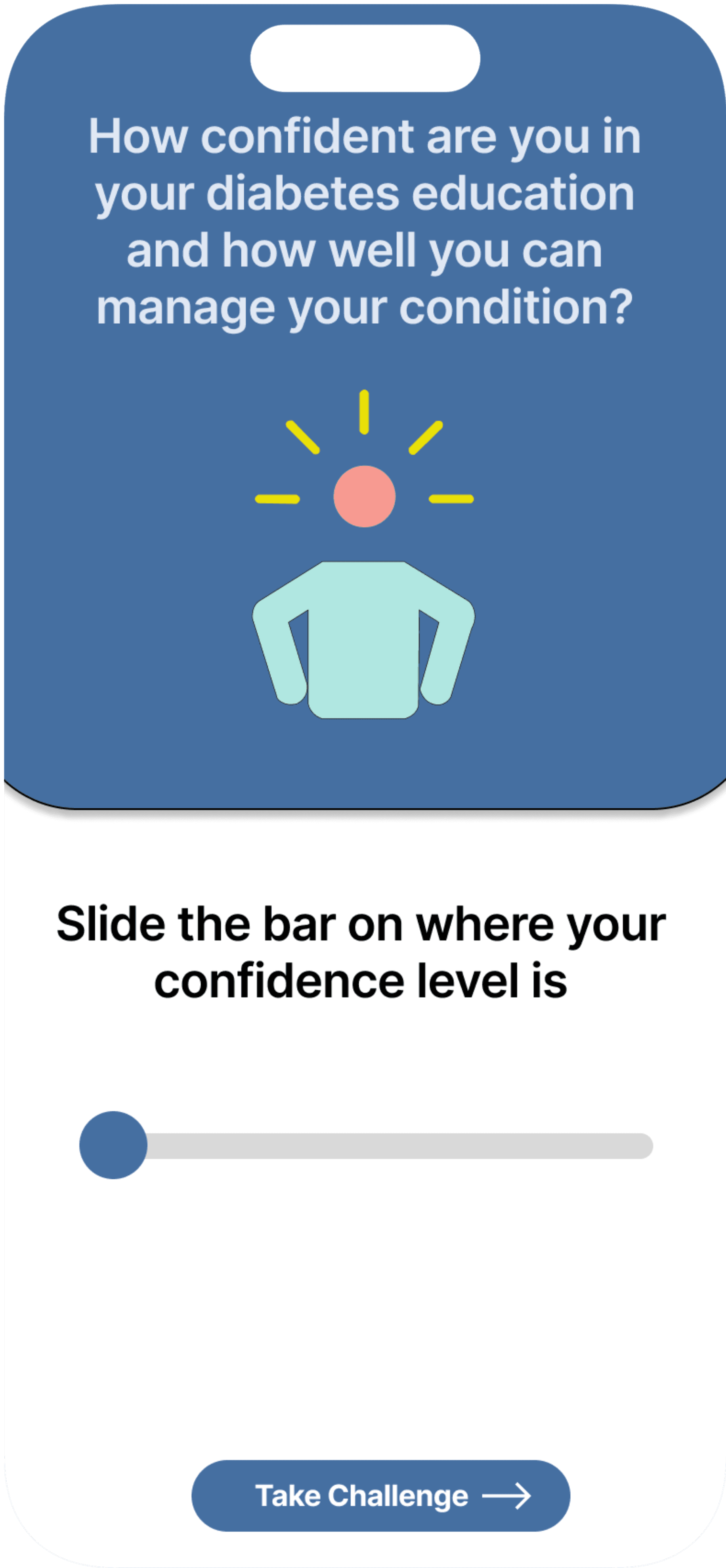
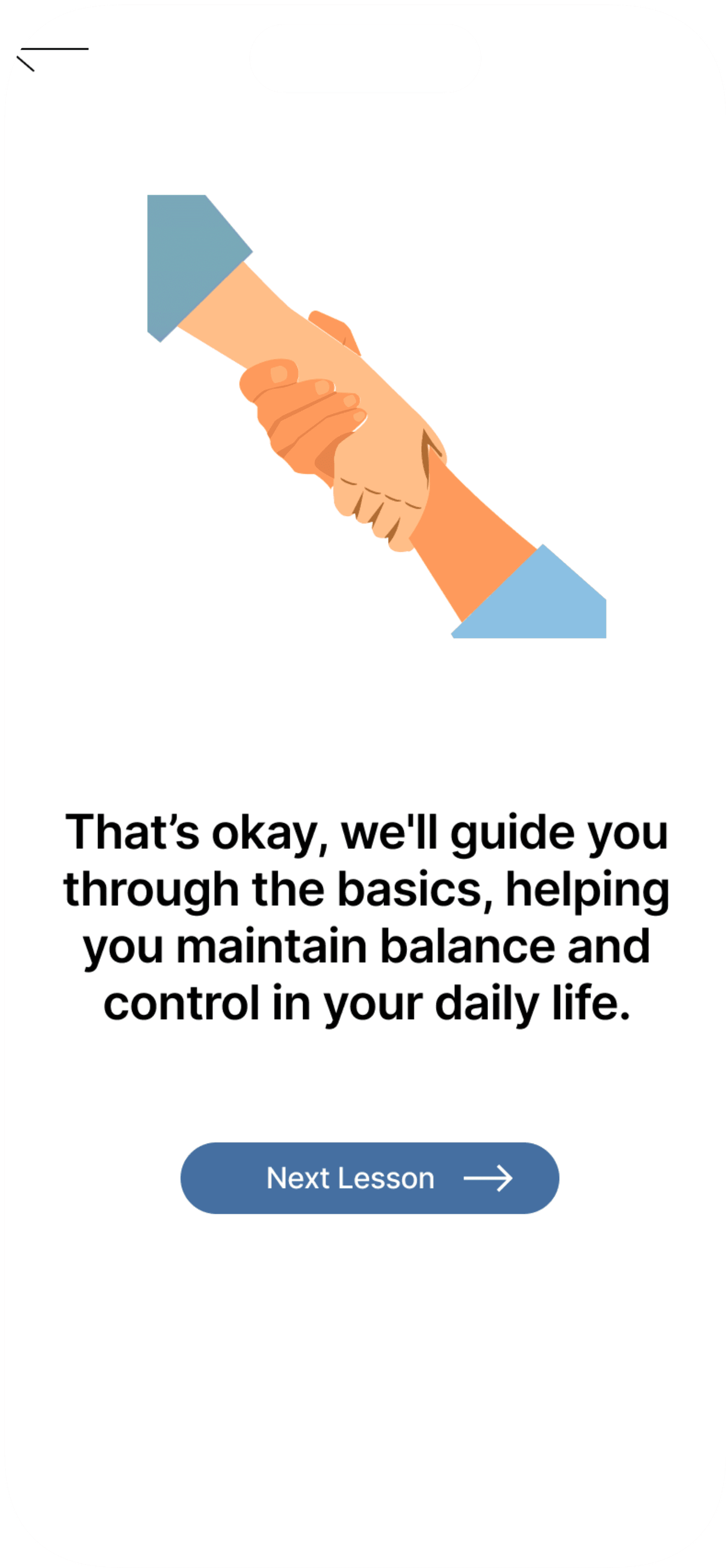
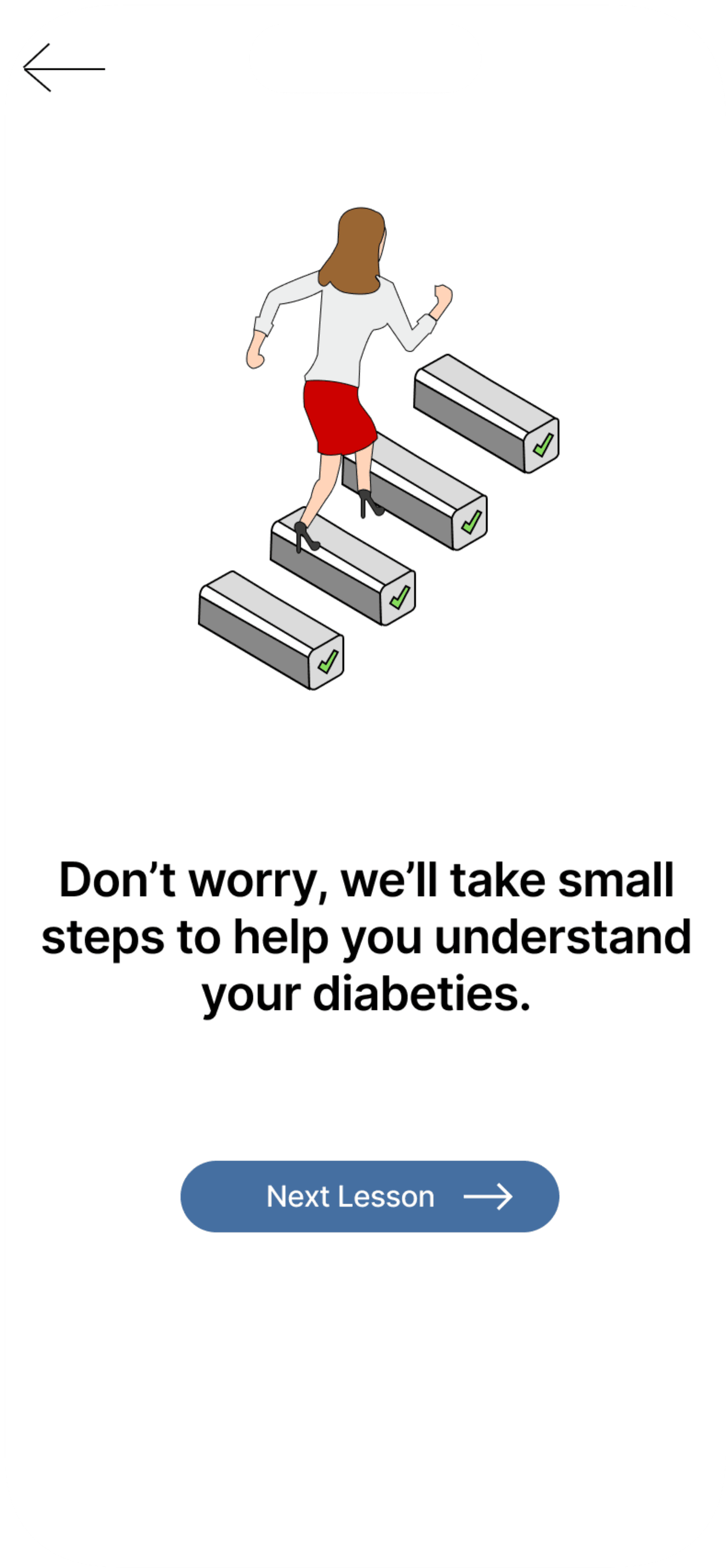
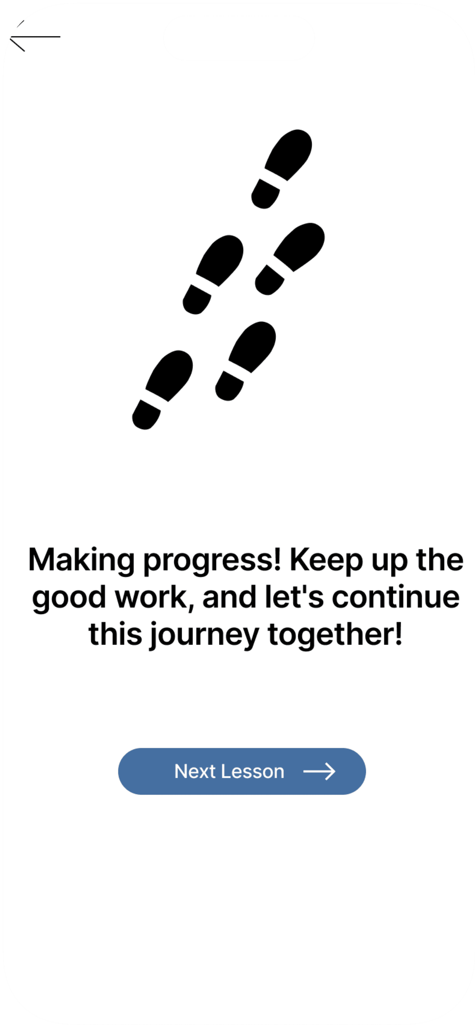

My Thought Process
Adding a slider had a better fit to the apps aesthetic.
The slider is more interactive, giving the patient and doctor a better read and data.
Sliders allow users to fine-tune their responses, reducing the likelihood of mis-clicks or errors compared to buttons or drop-down menus.
A
B
C

Final Design
03/Interview
The protocol that I created for my interview was an observational interview of intermittent work (i.e. usability test of the app). We observed how the user went about completing the tasks we asked them to complete on Thrive's app within the workspace and with the phone she was given.
The procedure goes as follows:
Ask for permission to record the interview
Tell the interviewee about the goal of the interview and how it will be conducted
Begin the the activity section of the interview
Ask questions about the activity section
Ask questions about the interviewee
We also assured the interviewees’ anonymity and that we would destroy all of the data (e.g. notes and recordings) we collected about the interviewee after the project’s completion.
Confirming the Protocol
Criteria
I decided to conduct an interview with a family friend, who has diabetes and has limited experience with technology.
The criterion I used to choose my interviewee has had diabetes for 20+ years, therefore they had a lot of knowledge about their experiences. She isn't tech-savvy, therefore we would be getting the most accurate results about the Thrive app. The interviews were conducted, at most, 48 hours before the interpretation session and the interview was about 20 mins.
Thrive's Competitors
First thing I wanted to look at were different companies that specialize in diabetes
04/Define
Sushma M

Age
57
Education
Bachelor’s in Business
Status
Married
Occupation
Housewife
Location
Dallas
TEch literate
Low
"While I can navigate basic apps, I often find myself frustrated with complex interfaces and hidden features. I prefer straightforward, user-friendly designs that don't require a steep learning curve."
Personality
Introvert
Thinker
Learner
Bio
Sushma has been living with type 2 diabetes for the past 20 years. She is not very tech-savvy and often finds digital interfaces challenging to navigate. She prefers simplicity and straightforwardness in the technology she uses.
Core needs
•
Manage her diabetes effectively with minimal hassle.
•
Gain confidence in her knowledge about diabetes.
•
Use tools that are easy to understand and operate.
Frustrations
•
Struggles with complex and cluttered app interfaces.
•
Finds it difficult to learn new technology.
•
Prefers clear instructions and intuitive designs.
Platform

Website

Mobile App
Sushma is a housewife who has Type 2 Diabetes. I asked her to test out the new slider feature to get results, and any improvements we can make to the feature.
Testing the feature
She has tried a lot of apps to track her diabetes, however she also wants to learn on how she can improve her own diabetes education
The slider feels interactive and engaging, making her feel more involved in the process.
She finds the visual representation of her confidence level helpful, as it provides immediate feedback on her input.
1
2
3
The slider is straightforward to use which allows her to express her confidence level without needing to understand complex ratings.
1
1
1
2
2
2
3
3
3
She would like the slider to be accessible with larger touch targets for users who might struggle with fine motor skills.
She would like simple, step-by-step instructions or a brief tutorial on how to use the slider effectively.
She would've liked readable labels or markers on the slider like "Not Confident," to help her understand what each position on the slider signifies.
Sushma sometimes worries that her confidence rating might not be as precise as she wants because her hand might slip while using the slider.
She occasionally finds it hard to adjust the slider to her exact desired point
She felt that the lack of clear labels or markers on the slider confusing, making it hard to determine what each point on the slider represents.
Pros
Cons
Improvements

Click the box to check out Enliven.
05/Reflection and Next Steps
After creating the slider and getting input from my family friend. The few things I want to improve on the slider is to add a number above the slider to indicate what level of confidence you are at. Instead of numbers, I could add labels with wording such as "Not Confident" and "Very Confident".
Accessibility was something I should've improved on. Adding a voice that would name the labels while sliding the bar would be helpful for people who are visually-impaired. Even highlighting the slider could help see the visual better.
More Features to the Slider
Addressing Accessiblity