Tools
Timeline
Implementing User-Focused interviews to create a more visually appealing, informative, and trustworthy platform for customers.
9 Weeks
Figma, Miro
2023
9 weeks
Enliven Case Study
Enliven
What is Enliven?
Enliven is a company that sells IV solutions, shots, and other health products to the private and corporate sector. This project is focused on redesigning its website’s accessibility and functionality.
Enliven is a company that sells IV solutions, shots, and other health products to the private and corporate sector. This project is focused on redesigning its website’s accessibility and functionality.
Context
Background
Problem
Users are upset!
The accessibility, design, and functionality of the Enliven website is not optimized to accommodate for all of its customers’ and/or users’ wants and needs.
The stakeholders of this website include almost anybody who is looking to be healthy, the Enliven Wellness LLC (e.g. owner, website designer/maintainer, marketing team, etc.), competitors/potential competitors of Enliven Wellness (i.e. companies that sell IV solutions and shots), and companies that make available and sell health-related products to the public. Suppliers are not included because the suppliers of this company will not be significantly affected by the company’s success due to the suppliers’ biggest customers being hospitals all around the U.S..
We will perform a redesign of the entire website to accommodate for its customers & users through focused rapid contextual design.
What we want to solve?
Our Target Audience
Stakeholders
Solution Statement

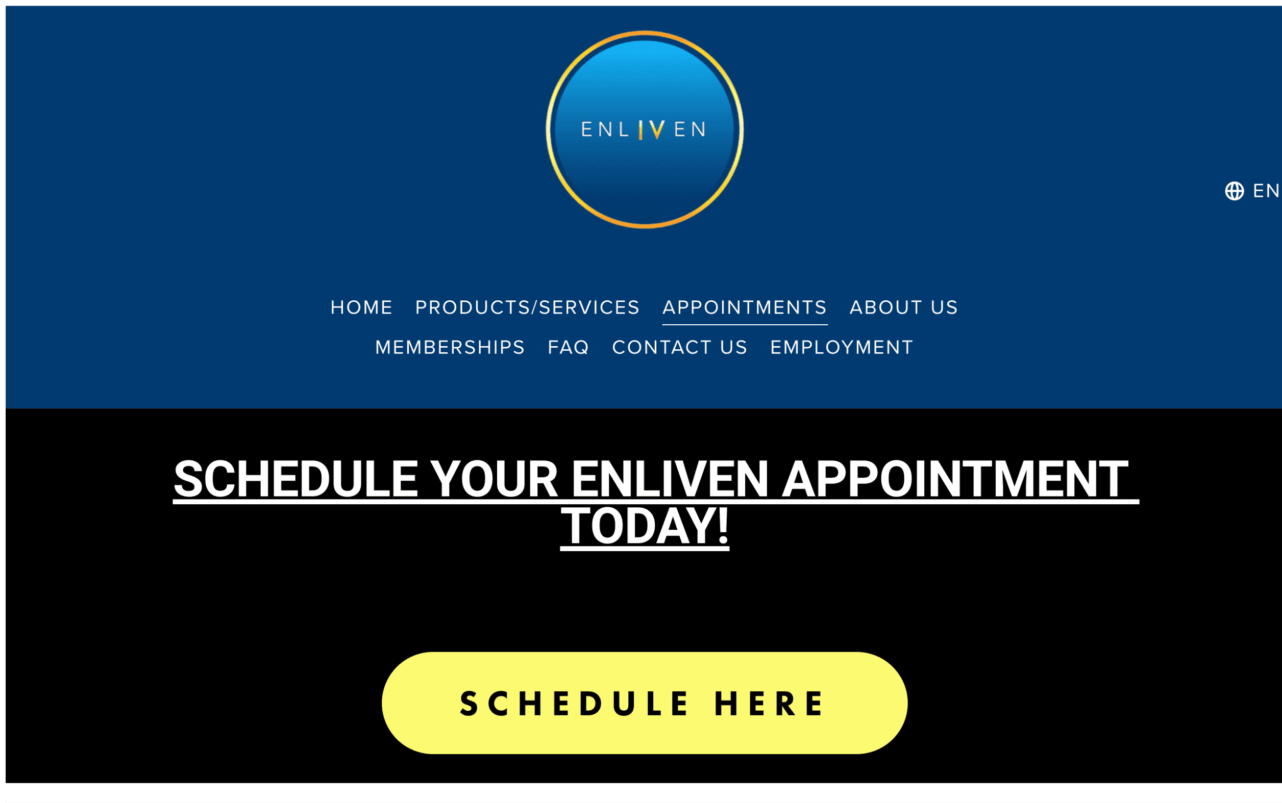
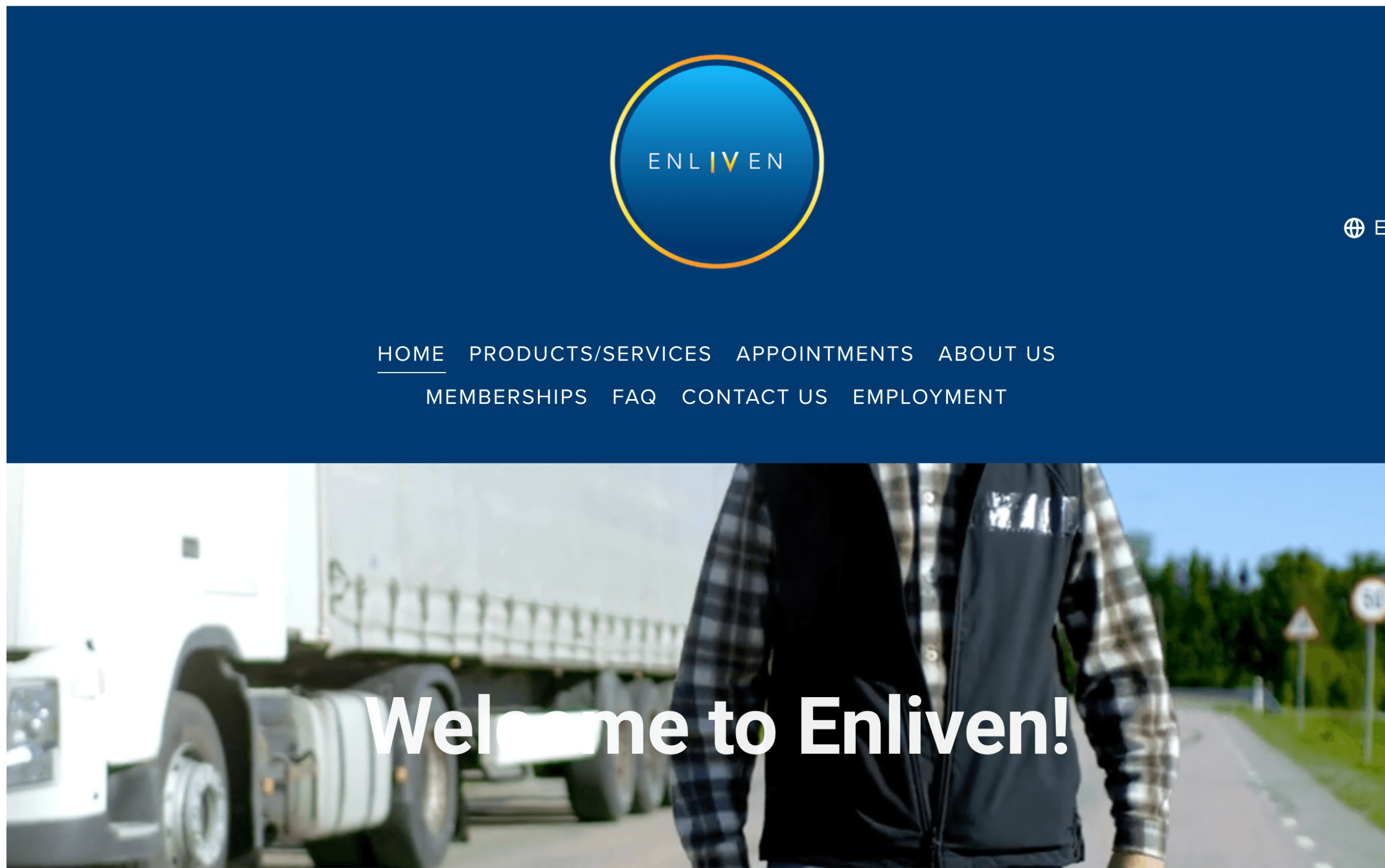
There isn't a "book now" button presented in front which will be hard for users to locate.
The video is half cut off which looks odd and doesn't entice users to purchase this product.
The layout of the website is lacking and although there is a schedule button placed in the middle, I don't have enough information to book an appointment.
I noticed there isn't any crediblity from any Dr. which automatically decreases trust levels.
For a first time user, adding a survey could help decide which product is best for the customer
Appointments
Products
Home Page
For a first time user, adding a survey could help decide which product is best for the customer
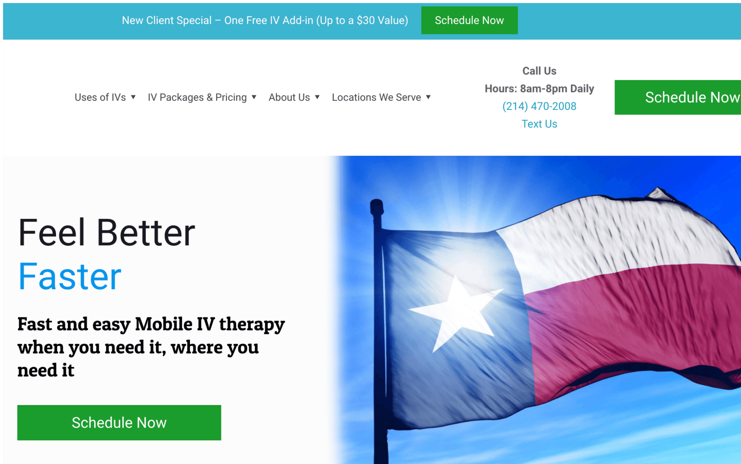
An aesthetic picture to entice customers
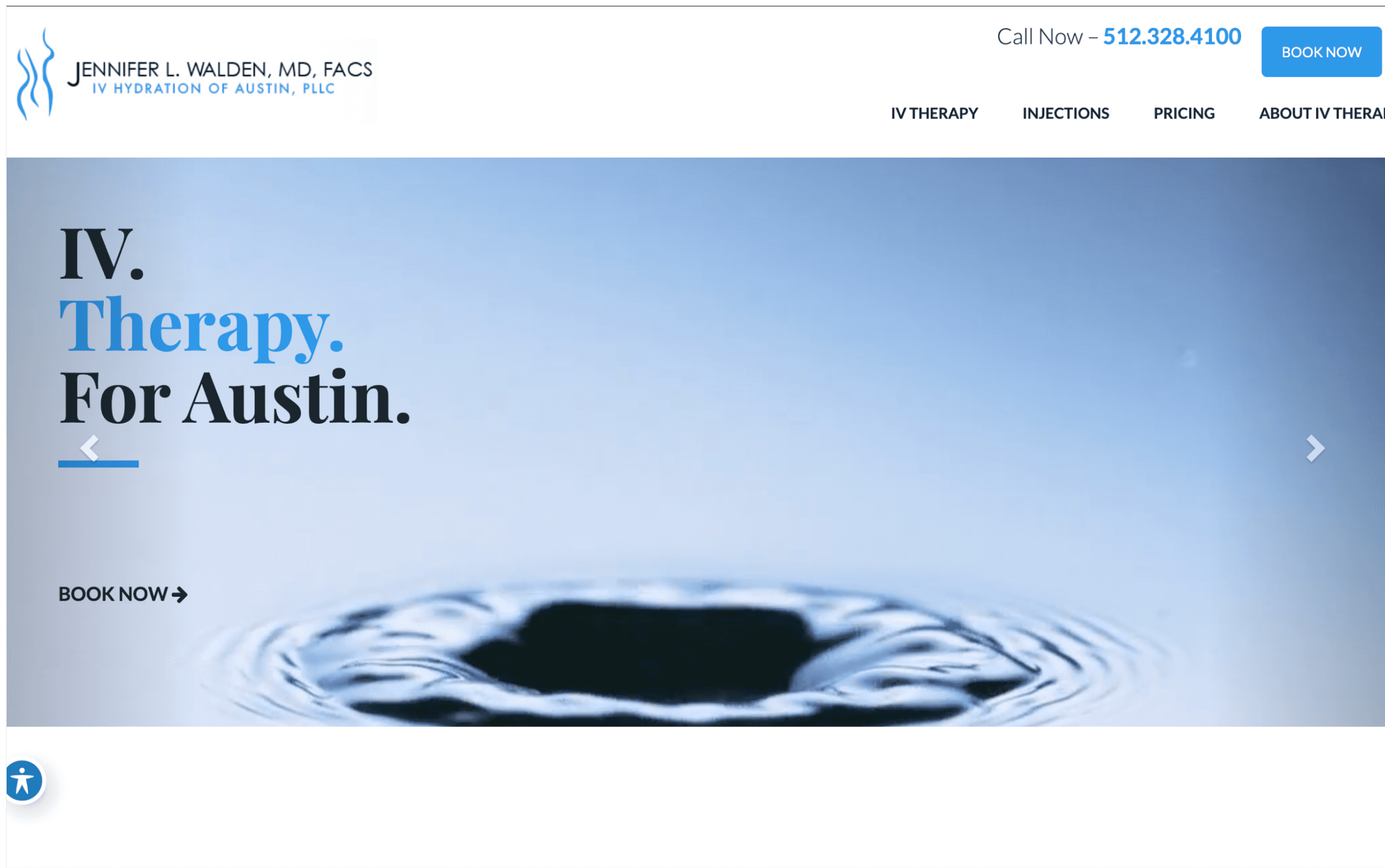
Instead of a city, we have water which looks aesthetic but could potentially be confusing for users
Adding the Texas flag brings in the culture which can represent a sense of comfort for the people.
There are three "schedule now" buttons all over the website which is straight to the point.
All three companies follow a similar layout which won't be confusing for users.
It's minimal, therefore your eyes tend to look in the middle, and then you notice the "Book Now" button.
The color palette is blue which brings more trust for the company and customers get slowly convinced.
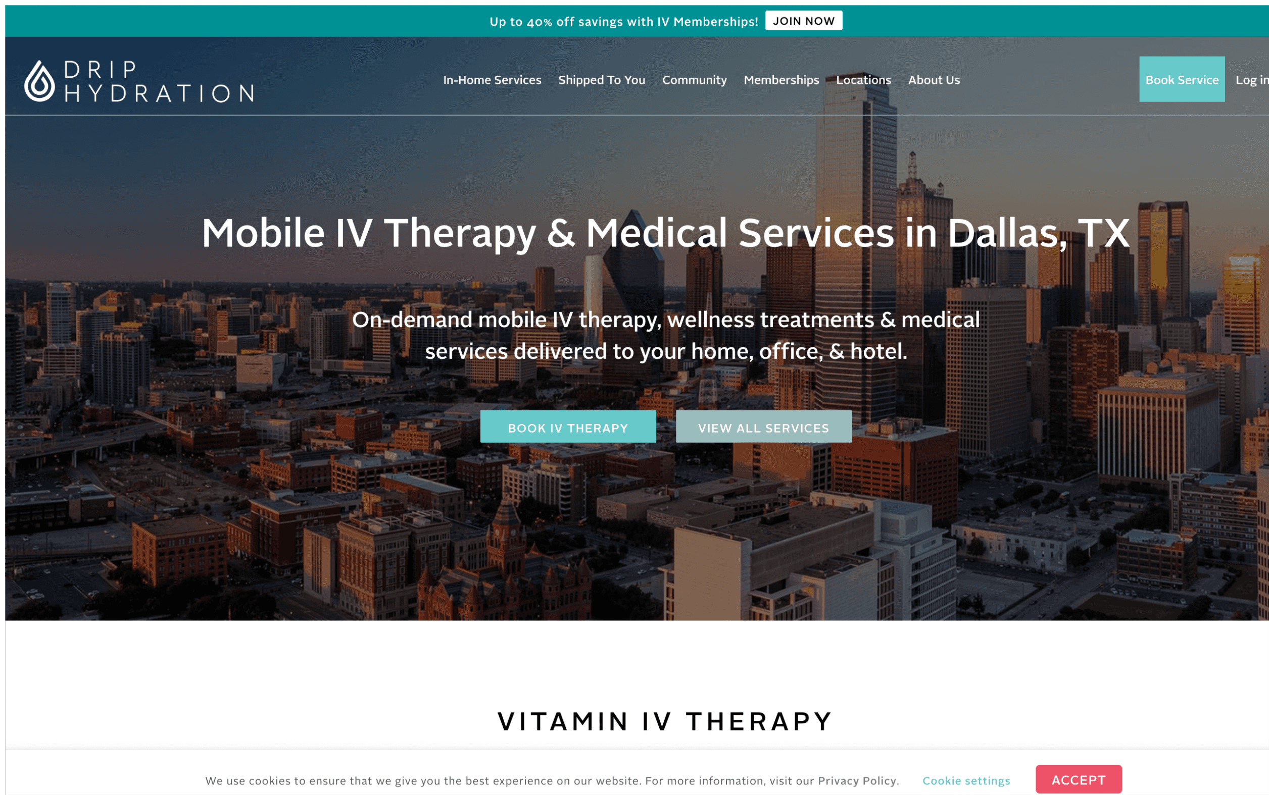
Color Palette is bright, exuding trust between the company and customers relationship
The website's layout is well-organized, with different size headings placed in the designated area and booking appointments with a different color button to catch your eye. There is a lot of information which is insightful for a first-time user.
A
B
C
A
B
C
A
B
C
What are other companies doing?
What are we doing?
I wanted to look at successful IV companies to get an idea of what's working for them
Old Website
Current Website
The Process
After understanding our needs, we began to soldify our design process.
01/ Empathize
We will be getting answers from users on what they want in Enliven's website
02/ Define
Our personas highlight the most important struggles.
03/ Ideate
Our team drew scenarios on what our users will go through with our added changes.
04/ Prototype
Our team's development of our current design and seeing what changes we need to make.
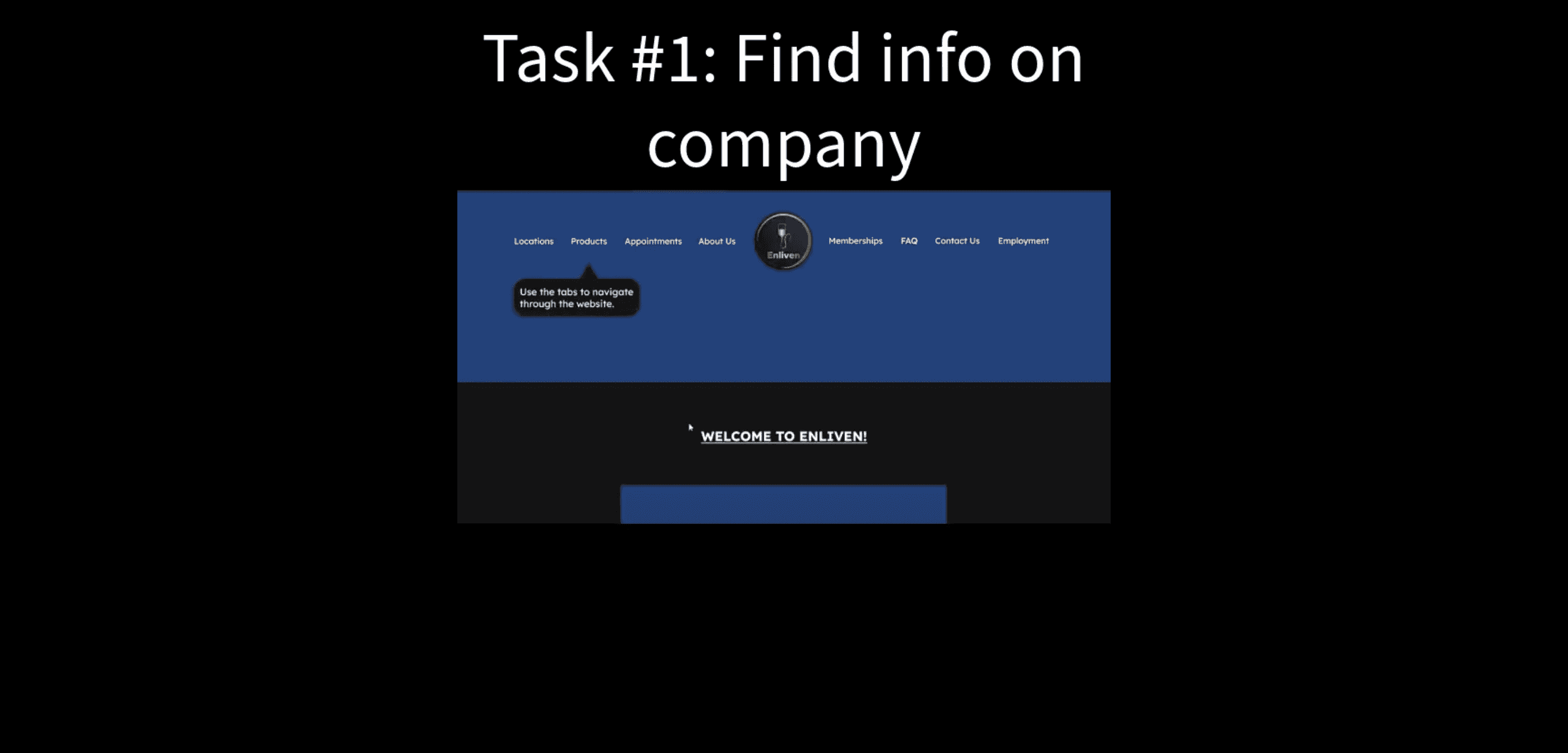
Our team created a video sharing our final designs to other users.
05/ Test
01/Empathize
Protocol & Questions
The protocol that we created for our interviews was an observational interview of intermittent work (i.e. usability test of the website). We observed how the user went about completing the tasks we asked them to complete on the company’s live website within the workspace and with the laptop/desktop device they chose.
The procedure goes as follows:
Ask for permission to record the interview
Tell the interviewee about the goal of the interview and how it will be conducted
Begin the the activity section of the interview
Ask questions about the activity section
Ask questions about the interviewee
We also assured the interviewees’ anonymity and that we would destroy all of the data (e.g. notes and recordings) we collected about the interviewee after the project’s completion.
Click the links to see our scripts and what each team member wrote for notes
Our team conducted these interviews to see what we were missing and receive in-depth answers from our interviewees
Interviews
The criterion we used for choosing interviewees was a significant age difference between both interviewees for each interviewer (i.e. one interviewer had two interviewees who were at least 10 years apart). The interviews were conducted, at most, 48 hours before our first interpretation session and the interviews averaged 45 minutes.
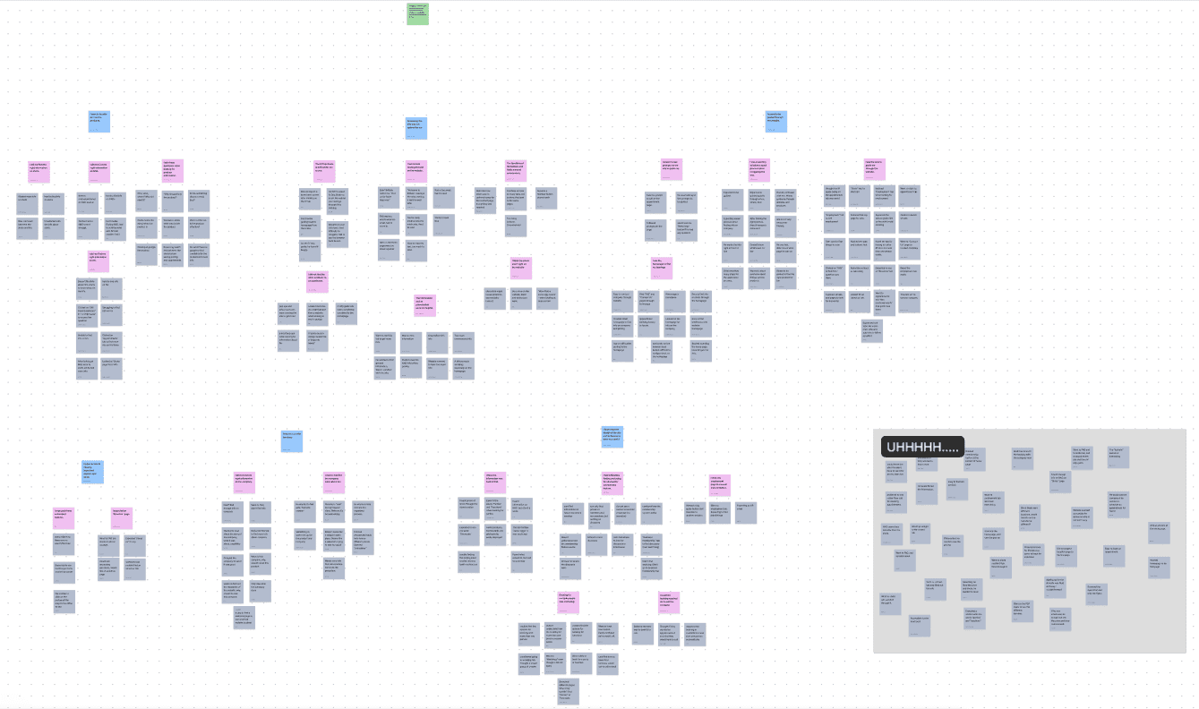
Click here to see the diagram more in-depth
The goal of our interpretation sessions was to create an Affinity Diagram. To start, our first interpretation session progressed a lot slower than anticipated. This forced us to have two more sessions within a week of the first session. Although having more than one session was less than ideal, it allowed us more time to ponder on what we could do with the affinity notes (e.g. how to organize them).
Interpretation Sessions
Affinity Diagram Here
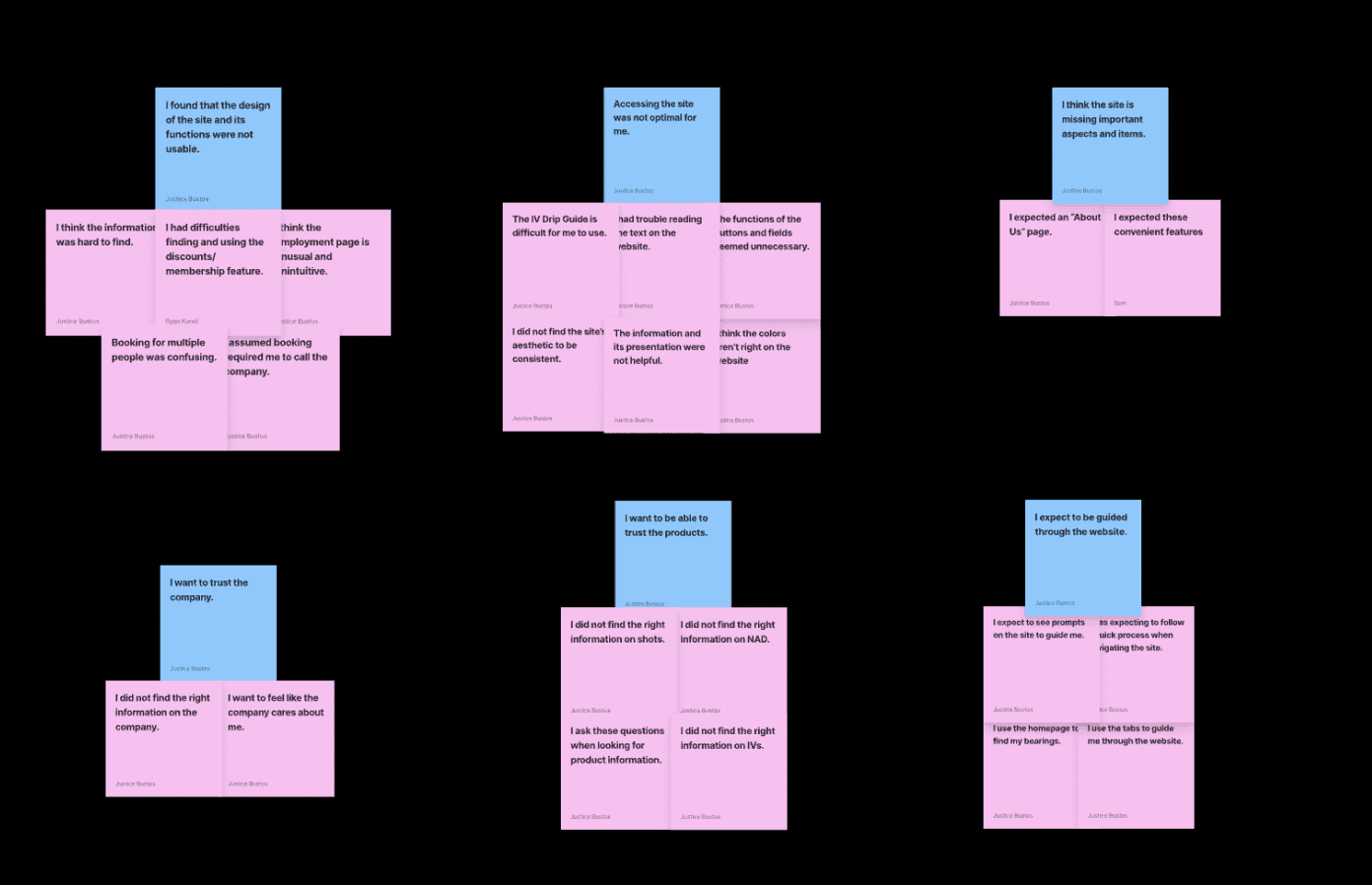
Our interpretation sessions averaged over 2 hours; the first session had all 4 members participating; for the second session, 1 out of the 4 members had to leave near the end of the session; and the last session had 3 out of the 4 members present. Prior time commitments/schedule conflicts were significant obstacles for this part of the milestone. Below is a display of the labels from the diagram.
We want our users to trust the product
We need the website to be optimal for not just younger users, but elders as well
Adding a step-by-step guide for new users to navigate through the website
Our Goals
A
B
C
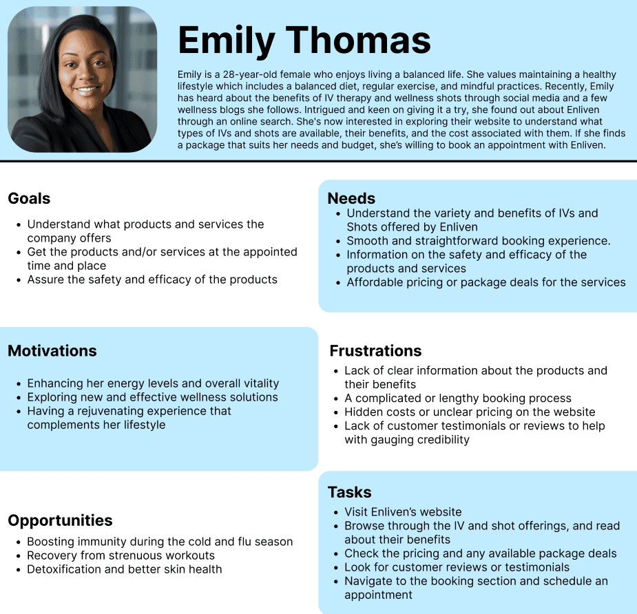
After interpreting the interviewees’ responses and actions, we created 4 personas to embody all of the interviewees. We segmented the personas into primary, secondary, and anti-personas. Each have helped us understand the potential use cases and contexts of the users and customers of the website for Enliven. Above are the personas we created.

1
2
02/Define
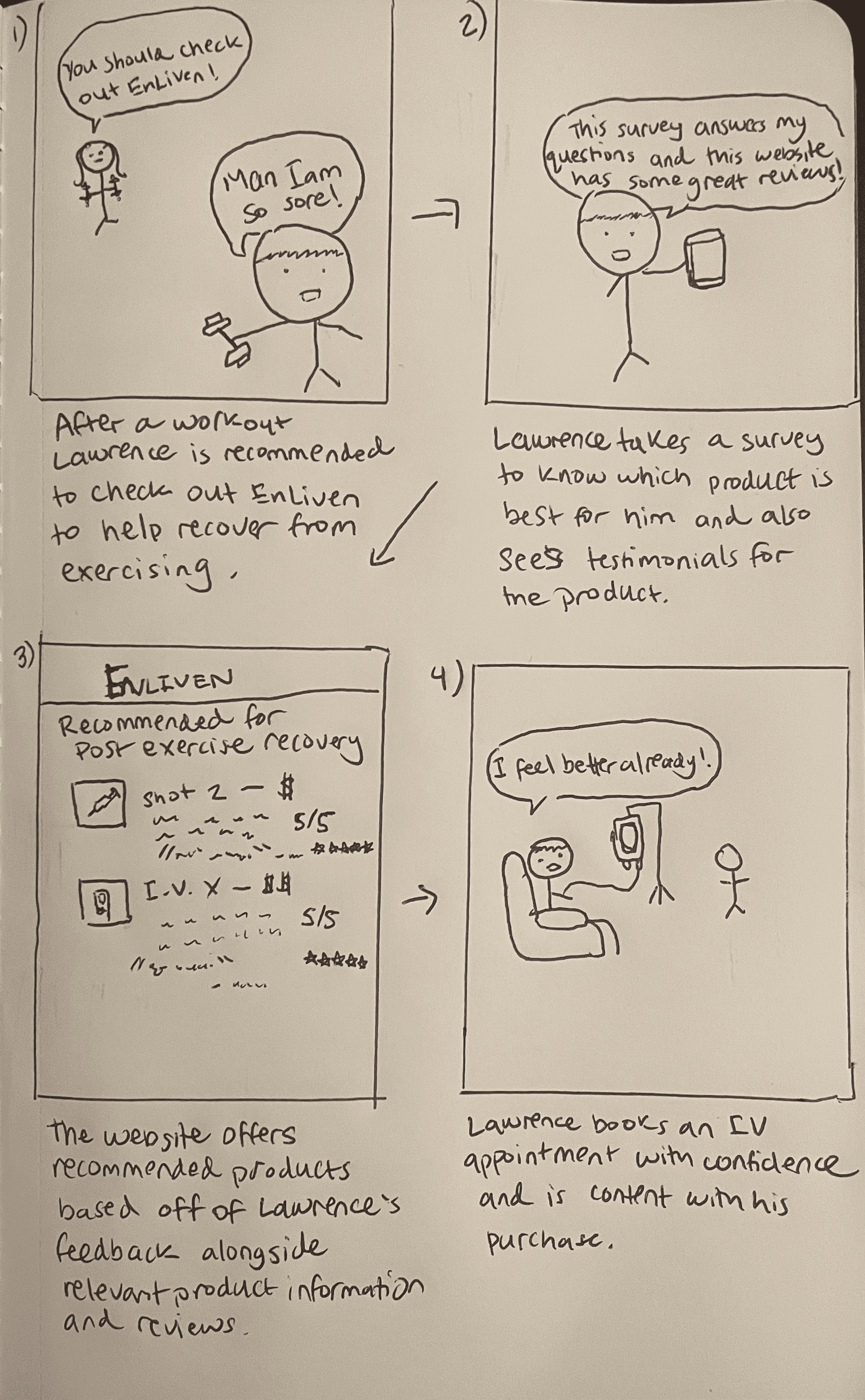
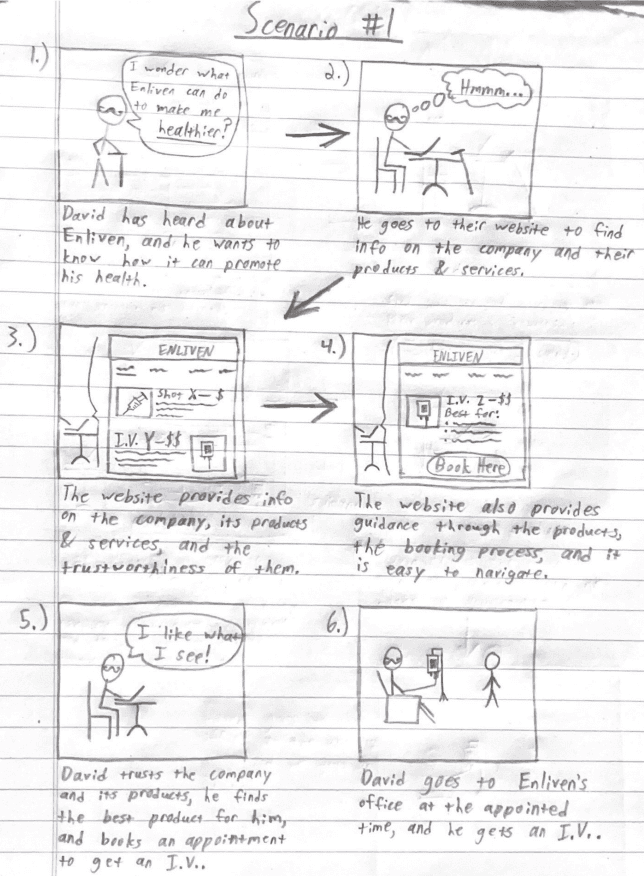
Once we created the personas after our interviews, we created scenarios for the primary and secondary personas. We created these scenarios including/involving the personas, and each have helped us understand the possible use cases for the users of the Enliven website. They help us what they may think and feel while using the website. Below are the three scenarios we created.
03/Ideate
Sketches
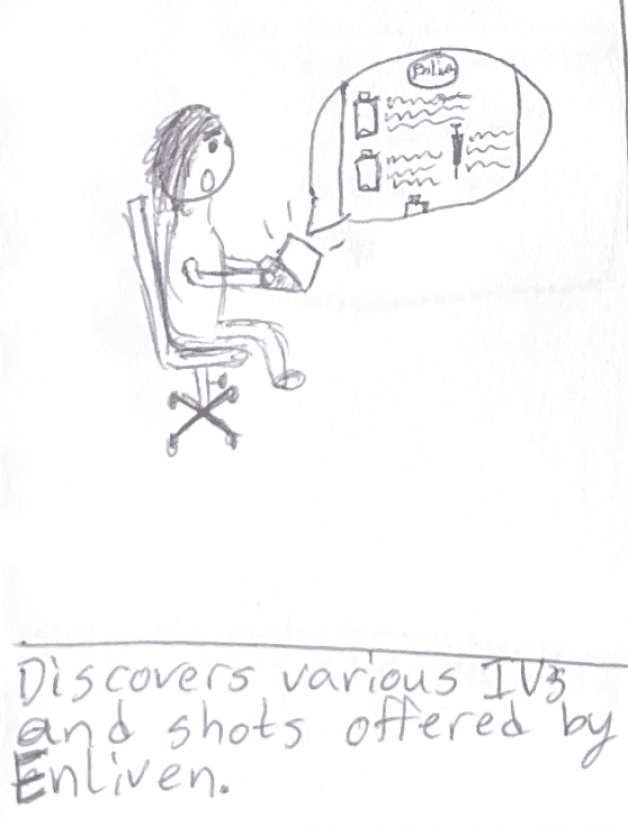

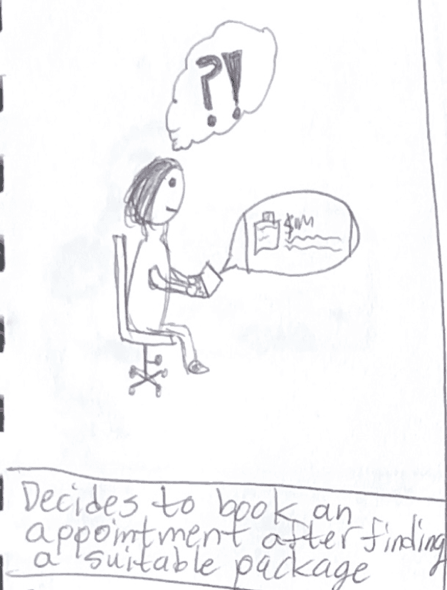
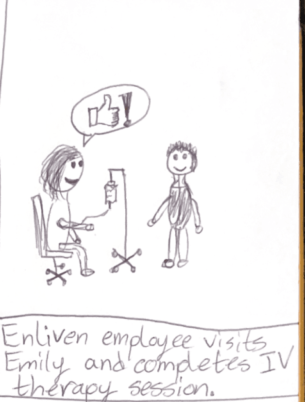
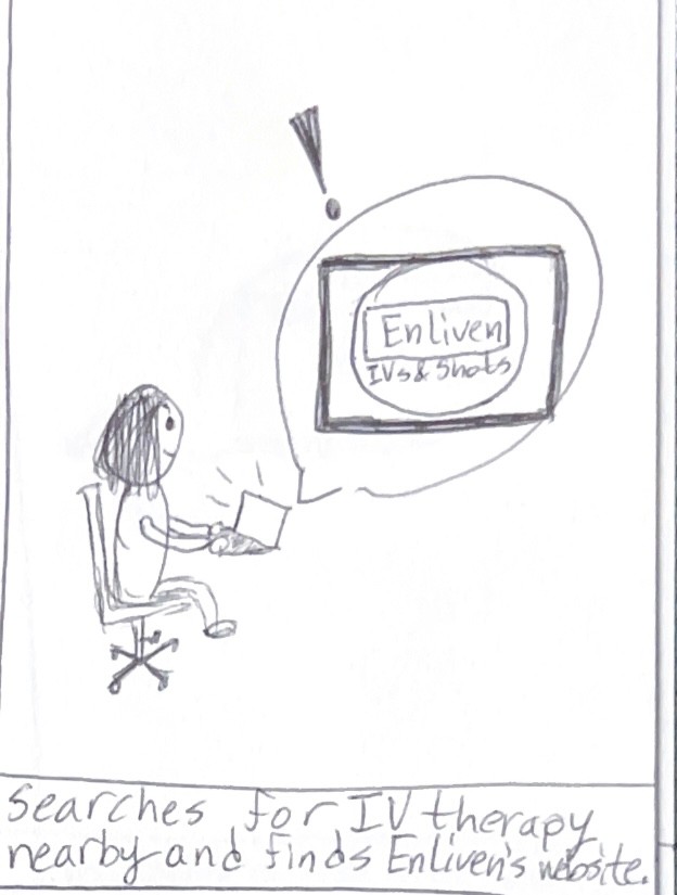
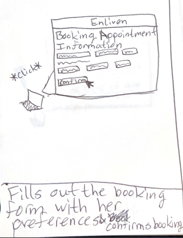
Our final low and high fidelity wireframes. Our goal was to make sure our users weren't confused but most importantly, we wanted to make the site more trustworthy
Low-Fi

04/Prototype
High-Fi

After creating the scenarios from our personas and interviews, we created our low, mid-, and hi-fi prototypes of Enliven’s website. We then conducted and recorded a user test on the hi-fi prototype to see how a new user would navigate the website.
Click the video below to see an in-depth process of our final designs
05/Test
Ship sites with style.
Go from design to site with Framer, the web builder for creative pros.
Get Started
Learn More
I would've loved to include a survey that users could fill out in the beginning to find out what's the best IV bag or NAD shot they need instead of endless scrolling
A feature that I would’ve loved to add is a hamburger menu on the side which displays all the categories. This would make the home page less cluttered and more organized
1
2
What more could we have done?
Reflection/Takeaways